Instead of spending thousands of dollars in web designing, one should understand universal web design principles. So, he/she can give the right direction to any web designer in London.
It is a fact that many efforts are useless without any substantial direction. But how a web-based business owner incorporates all the right principles? So, the majority of visitors turn into customers.
It’s simple.
If you require conversion-focused Universal web design in London, then you must know the real thing that converts a visitor into a customer.
We will present to you the real knowledge in a digestible form. So, you must keep reading.
Universal web design principles: Visual hierarchy
Visual hierarchy enables visitors to recognize the vital elements of the webpage without reading any words.
For example, if you want many calls to actions on a page, then you must emphasize the important call to action in a bold and prominent way, which can be a special icon, larger button, or boldface.
If you want to leverage visual hierarchy, then you must determine the business objective.
For comprehensive Universal web design in London, you must follow these principles of visual hierarchy.
Page scanning pattern
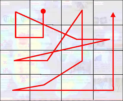
People have the natural tendency to scan the page before deciding to read it. The scanning pattern always looks at the top-left of the page, and then it looks at the top-right of the page.
So, to capture the attention, you must put the important element at these two corners. Moreover, the visitor also looks at the bottom. That’s why you must grab attention with any hook at the bottom.
You can use visual elements at the four corners in order to give direction to the visitors. If you have information according to the scanning pattern, then your page has a good chance to convert.
Size
People always read bigger elements initially on the page. That’s why you need to produce important information in a big size on the page. You can instruct your web designer in London about the size of important content.
Bold and high contrast
It is no brainer— high-intensity colors and boldface draw much attention. That’s why you need to use bright colors and boldface to convey your important information. This way, you capture the mind in a positive way.
Typeface weight and pairing
You need to establish a visual hierarchy by putting weight on the stroke. That’s why we often use boldface on important phrases. You can also use italics and underlining to put more emphasis on words.
Headings and subheadings
You need to put headings and subheadings in a consistent way. It will establish the flow of your information in the right way that converts a visitor. So, the reader can understand the hierarchy of information.
Directionality
Our brains read everything in a grid way that is horizontal or vertical. If anything breaks the grid, then it captures attention. So, you can use this trick in order to hook the reader.
Space and texture
You need to understand the design elements. So, instead of making everything bigger and louder, you can leave space to create texture and tone, which can draw attention.
Universal web design principles: White space and clean design
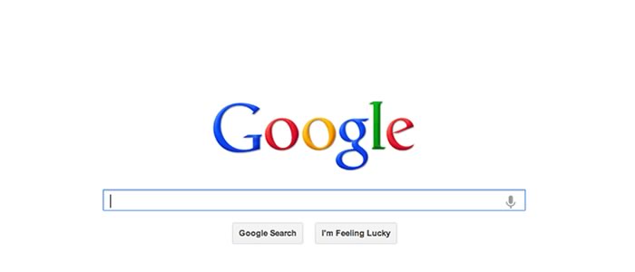
The key to removing clutter on the page is using white space with clean design. This way, the visitor does not have to dig deep and know the information immediately.
White space
Website readers have an attention span less than 8 seconds. That’s why you have that time to hook the reader. But everything cannot be summarized in three sentences, which is a problem.
And white space is the solution.
White space is the space between design elements. You can use it to convey your message conveniently in minimum time.
To use the white space effectively, you must design the white space with legibility, branding, and focus of attention.
You can instruct your web designer in London on this aspect.
Grid system
If you have a lot of content on the page, then you can use the grid system. It will convey your information in an organized way. As a matter of fact, the grid system is in use for centuries in order to convey information in a digestible form.
Typefaces
Nowadays, you have the choice to use hundreds of fonts. But you should not use more than three font combinations. Otherwise, it will repel the reader. And you do not want that. So, use a maximum of two or three fonts on your page.
Colors
You must not use many colors on your page. In fact, your main colors must not exceed three. If you use more than three colors, then it will not go right with your brand style.
Images
You must not use moving images on your web page. It will distract your visitors, and they will leave important pieces of information. Moreover, you must use images according to the tone of your website.
Golden ratio
The ratio found in nature is called the golden ratio. And it is always 1:1.618. You should incorporate the golden ratio on your webpage. This way, your page will look natural. Ultimately, the reader will convert.
Layout dimensions
You must design your layout, keeping the golden ratio in your mind. Popular sites use the golden ratio in the width of columns.
Spacing
Spacing is trickier on every page. But you should start with the golden ratio diagram. It will give you an ideal spacing between all design elements.
Content placement
You must use a golden spiral for placing your content on a webpage. It will convert more visitors if you do so. All authority sites place their content in a golden spiral. This way, these sites get what they want from the visitor. You can also do that.


