
The challenge
Look dependable without looking dated.
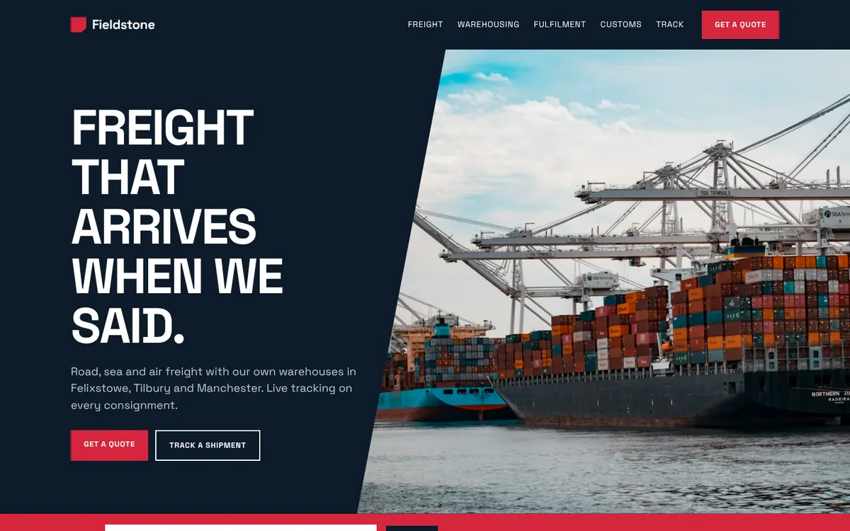
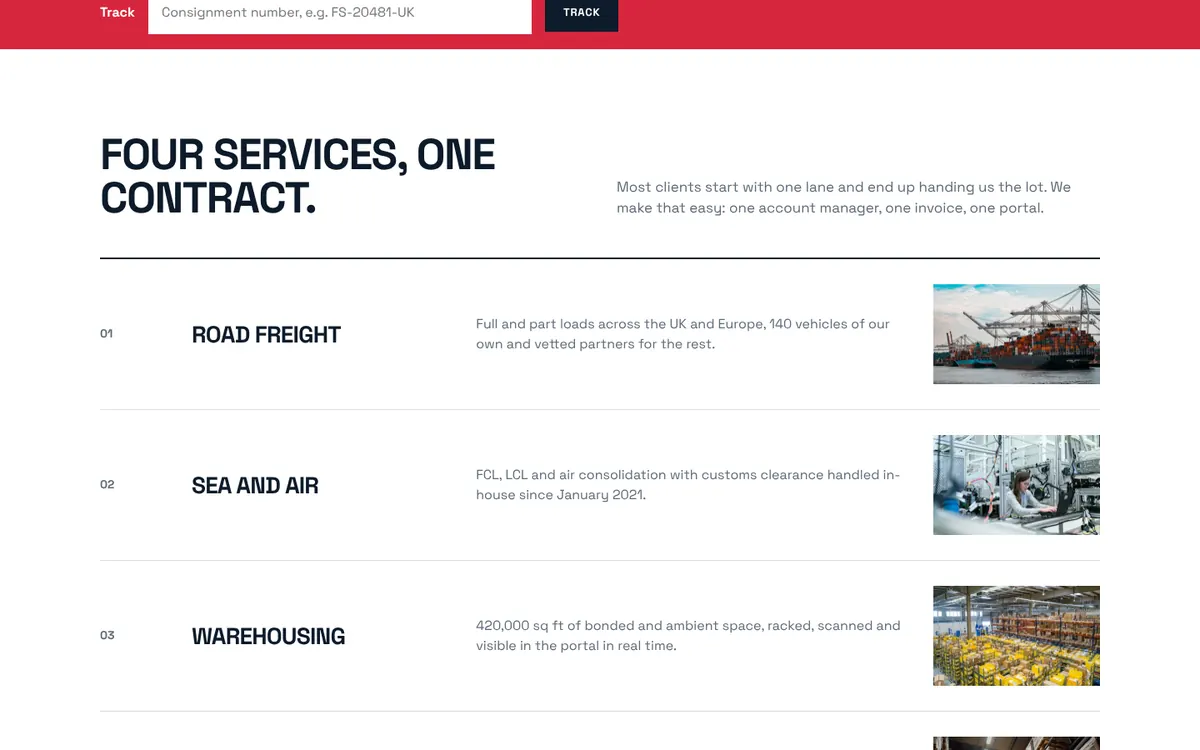
Logistics websites are either corporate blue templates or trucks at sunset. The concept needed authority and pace.
The approach
Type, angle, red.
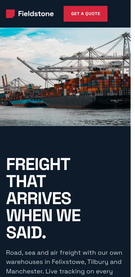
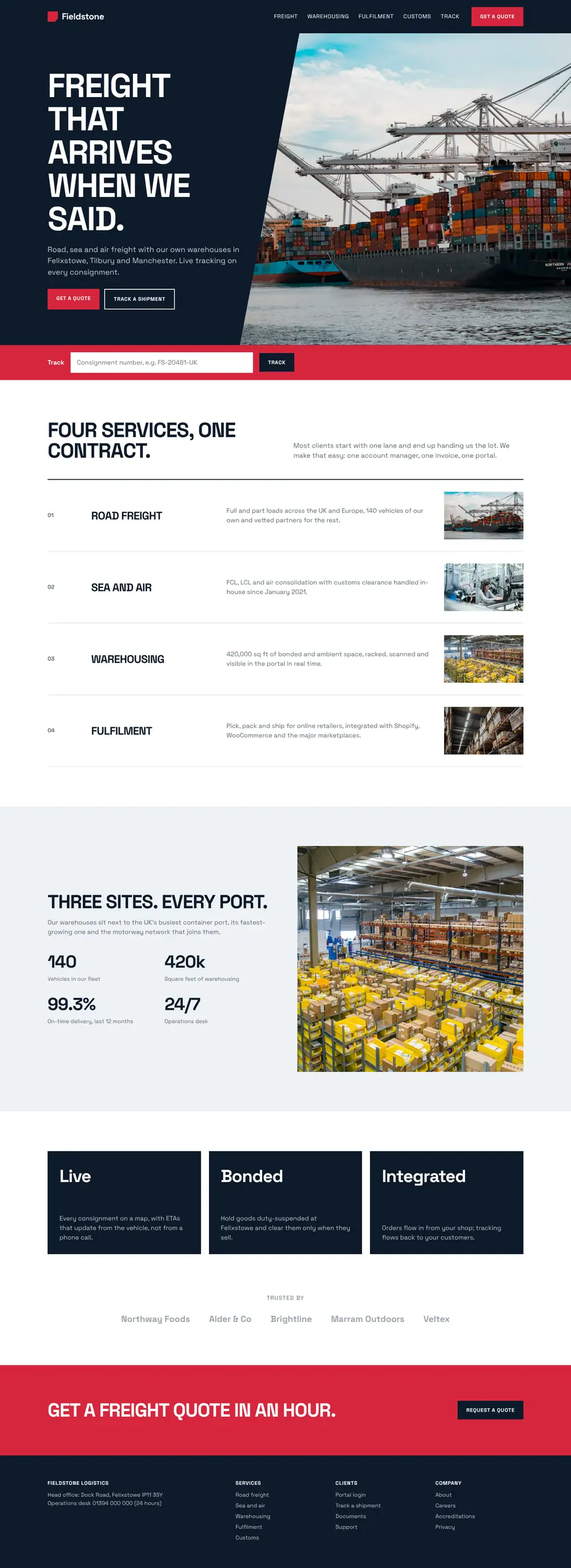
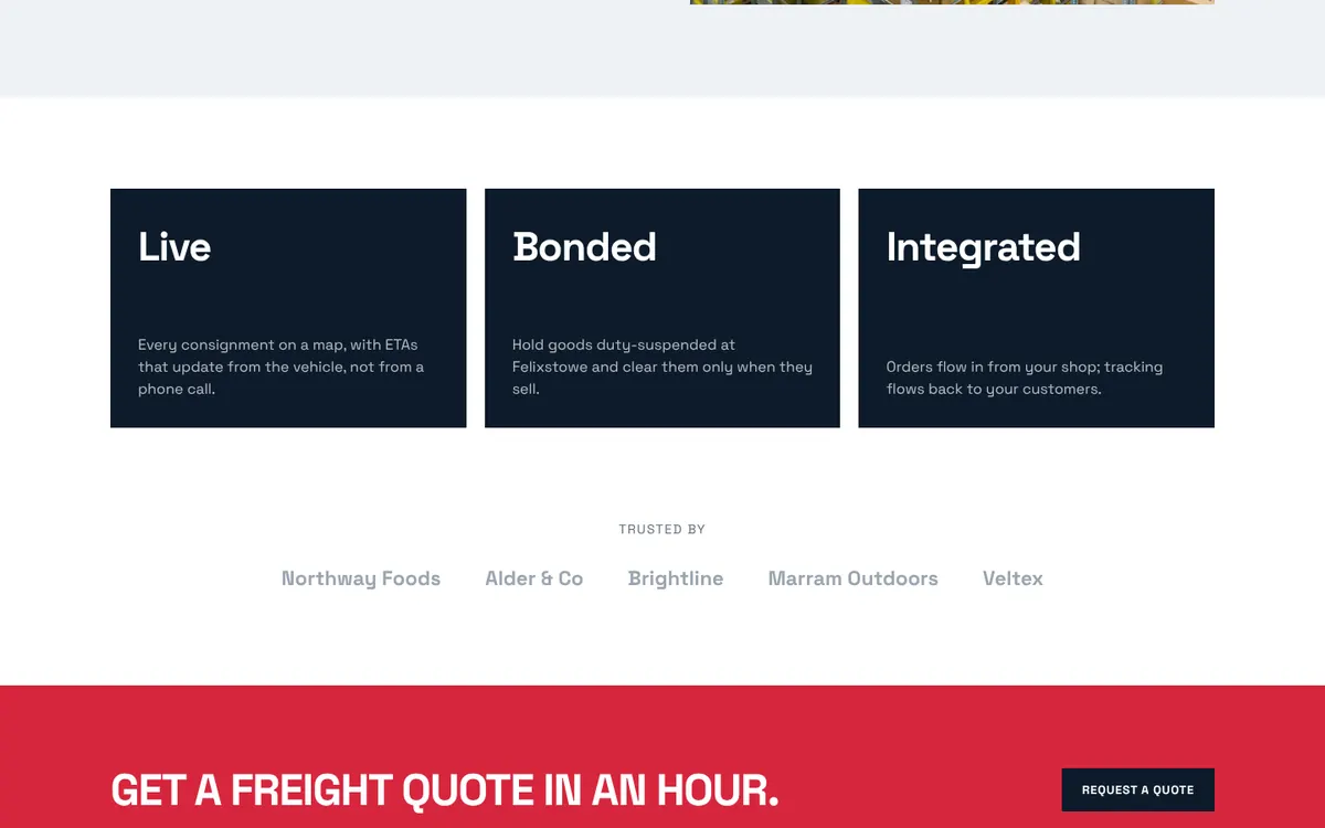
An uppercase grotesque does the heavy lifting, the diagonal cut adds movement, and a single red carries every call to action.
The outcome
A site and a portal from one design.
The portal uses the same type, colour and table language, so a customer moves from the site to their consignments without a visual jump.