

In today’s modern and technological world, websites play a vital role. Websites are now the main element of branding and establishing credibility. However, the design of your web page is what truly matters. It could change the game for you!
Graphic or web design mistakes can ruin your web page. Web design mistakes can cause a considerable fall in website traffic. Are you sure you would want your web page to suffer? If not, this blog is just for you.
We have come up with a list of the 13 most common graphic and web design mistakes. By avoiding these mistakes, you could save the appearance and interface of your webpage.
Delayed Loading

Waiting for a long time can be annoying. Users are highly impatient when it comes to the slow loading of a web page. Users are likely to immediately leave a website if it takes too long to load. Having a low bounce rate is only possible if your webpage quickly loads.
However, what makes your webpage slow? Your webpage may contain one or more of the following problems: –
- Excessive JavaScript, jQuery, and files.
- Too many animations or effects
- Lack of optimization in images and videos
According to reports, 57% of users are likely to leave a webpage if it takes more than 3 seconds to load. That indeed is a short time to keep users engaged.
Weak Navigation
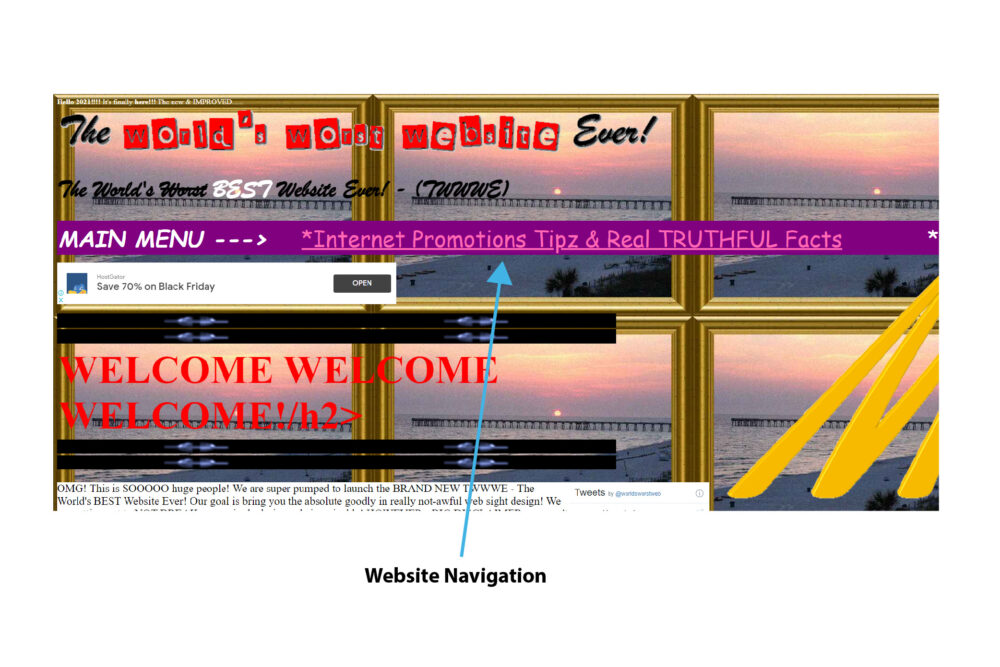
Navigation plays a vital role in helping users to access and use a website. You cannot ignore navigation when developing a website. However, one of the most common web design mistakes is overstuffing the menu. Users hate a website that is too difficult to understand. Most users may get troubled by a complicated website.
A unique menu may add to the beauty or aesthetic of the webpage. However, it is also more likely to make the webpage complicated. As a result, users may leave the site due to its complex features.
Creating a menu that is not overstuffed and allows users to get the job done instantly is better. However, to make your webpage stand out, it is still important to add a unique element. Creating a navigation menu that is minimalistic and easy to operate allows a delightful user experience.
Lack of Compatibility with Browsers

One of the most common web design mistakes is not considering the site’s compatibility with standard browsers. As a result, many web designers miss out on testing the website on common and modern web browsers. Trying the website on only one browser is not enough. The more browsers you test the website on, the better its compatibility.
If your website is not compatible with common or modern browsers, the website traffic for your website is likely to fall.
Designers should test the website on modern and common browsers like Google Chrome, Safari, Opera, Firefox, and Internet Explorer. By doing so, dropped site traffic is easily preventable.
Un-responsive to Mobile Interfaces
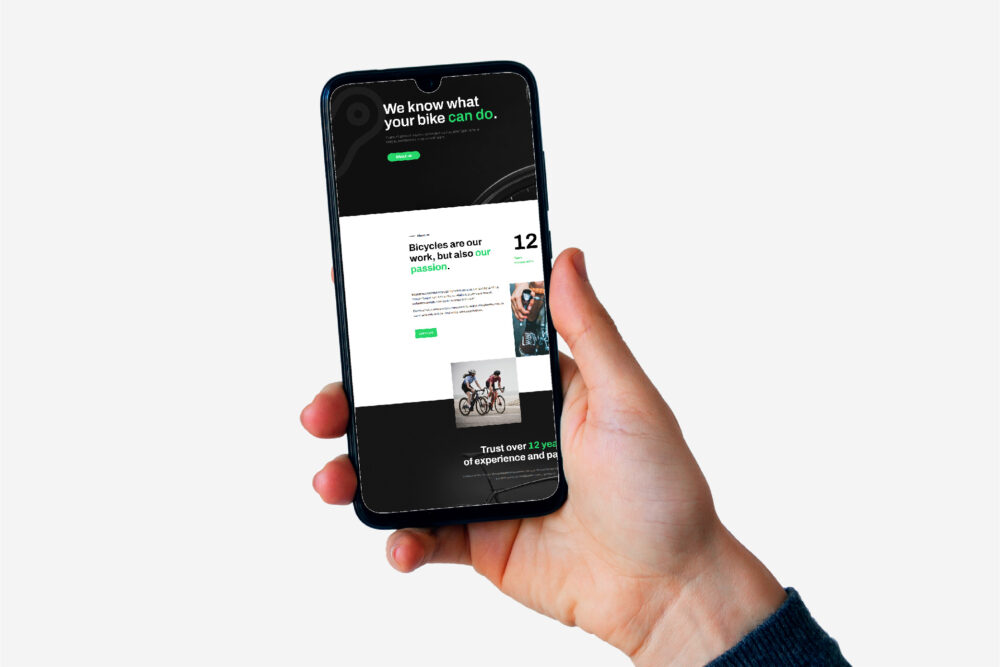
Most websites are not mobile responsive. Yet, ironically, most of the website traffic comes from mobile users! Statista states that 54.8% of the world’s site traffic comes from mobile phones.
Most web designers develop the site so that the content cannot adequately fit on a mobile screen. As a result, users find it difficult to scroll or surf through the site.
Since most of the website traffic comes from smartphone users, designers need to avoid developing sites that are not mobile-friendly—testing the website on various smartphones before the launch can prevent this web design mistake.
Excessive Irritating Pop-ups
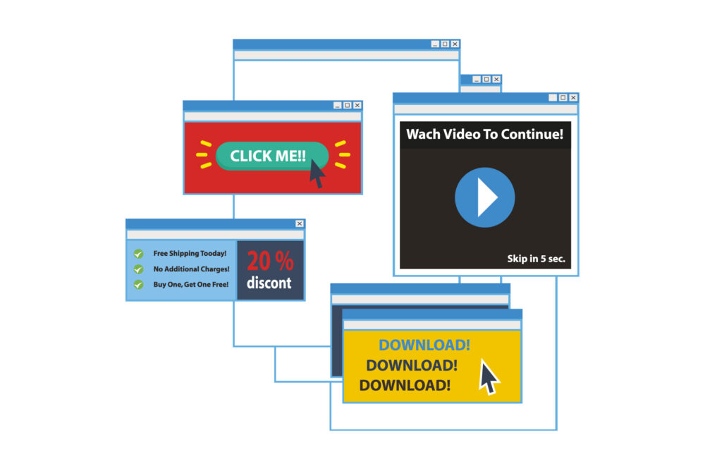
Although pop-ups help boost and grow leads, using too many of them may take away expected benefits. When visiting a website, the most annoying thing about it is the number of pop-up windows that emerge. The minute you visit a website, a pop-up takes over your screen. Pop-ups can kill the user experience if they appear just after the user lands on the website.
How can you expect users to subscribe or sign up for your service without exploring your website? Hence, pop-ups are not needed as soon as the user lands on the site.
Pop-ups appearing too soon or in an excessive amount may irritate the users who wish to know more about your site. Excessive pop-ups may cause users to leave your site. Web designers should prevent adding too many pop-ups.
No Search Box
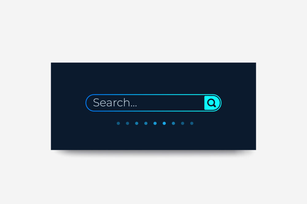
Almost every website requires a search box. Users can quickly look for what they want by using a search box. The absence of a search box may lead to an awful user experience.
No one likes to go scrolling through several pages to find what they need. Users will get annoyed and leave the site. Having a search box facilitates users to search for what they want in a shorter time. However, visibly placing the search box is also essential.
If users quickly get answers to what they’re looking for, they will return to your site for more searches.
Unorganized Layout
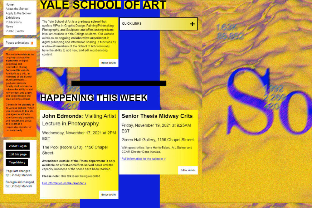
One common web design mistake is randomly placing content on the site. Unorganized content may appear in an unattractive manner. It may even cause the users to get confused while surfing the website. Users would not prefer to return to a site that contains messy content.
Presenting the content in a visually satisfying and attractive manner assures the authenticity of the site. Users prefer a straightforward website with suitable design elements. A website should not include too much random information.
The absence of proper structures or layouts would lead to a lower number of visitors.
Suitable fonts, headings, sub-headings, colours, grids, columns, and paragraphs can help organize content.
Excessive Advertisements
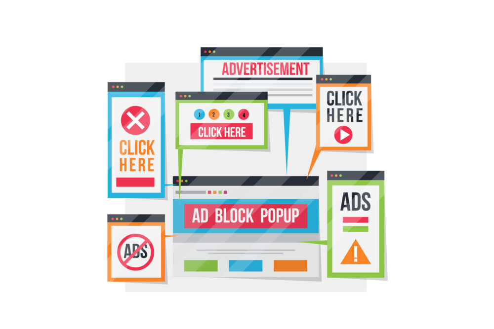
Although advertisements are an effective source to earn revenue, they can be a headache for most users. Keeping a specific space for advertisements will prevent users from leaving the site due to excessive adverts.
Excessive adverts may prevent the users from knowing what the site is about. In addition, it may get annoying to view multiple adverts after each action taken. As a result, users may leave the site, and the bounce rate is likely to increase.
Avoiding this web design mistake is likely to get you a better search engine rank. However, if not avoided, it can lead to a drop in site traffic.
Absence of CTA

CTA (Call-to-action) prompts users to take action. A typical web design mistake that most designers make is the absence of CTAs. Websites that have CTAs have a better conversion rate.
CTAs push users to buy a product or service. Therefore, strikingly developing the CTA with relevant information and details will increase user engagement. For example, the CTA should tell the user what happens after clicking a specific button.
Lack of Relevant Information

Lack of relevant information on the site is likely to create doubts for most users. On the other hand, providing enough information helps create an image and establishes credibility. Relevant information may include contact details.
If users are not satisfied with the information presented on the website, they are likely to leave the web page. Therefore, developing a relationship of trust with the users is very important. To do so, the web designer must create a site that contains relevant contact details. The details can be placed under the home page or on a separate ‘Contact Us’ page. By doing so, conversion rates of the site are likely to increase.
Lack of Privacy Policies

In today’s digital world, privacy protection is a necessity. Users still hesitate in providing contact or bank details. If a site is not secured, users will not take the risk of browsing the site. Modern browsers easily detect if a site is not secure. Hence, users are aware of the security of a website. Users will be more likely to back out if the site is unsafe.
Web designers can use the following ways to offer users privacy protection and security:
- Two-factor authentication
- HTTP
- Confirmation via email or Sim cards.
- Security questions
Inappropriate Use of Colours
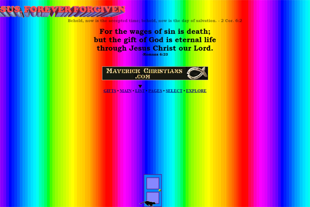
One web design mistake that is very common today is the improper usage of colours. It is essential to understand that the type of information displayed on the site will determine the selection of colours. For example, using flashy or vibrant colours for a hospital’s or state agency’s webpage will create a negative and confusing image.
Using two to three colours with similar undertones or suitable colour combinations will attract users. In addition, such colours will create a positive image for the site, keeping users engaged.
Too Much Text on a Page
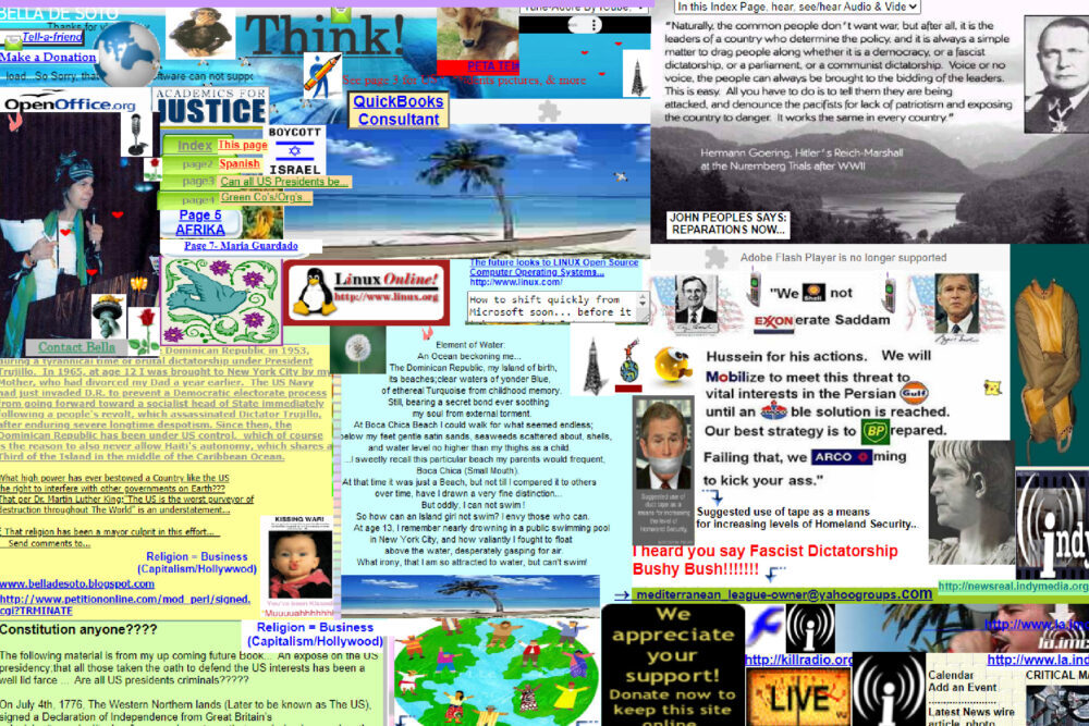
A web page consisting of excessive text is likely to force users to leave the site. No one likes reading too much text on one page. Creating a website that consists of minimal yet important text is expected to keep the users engaged. Too much text is likely to feel like a burden to the eyes.
Keeping minimal and easy-to-read content on the web page will always invite more visitors than a page filled with text. Less text paired with images and animations is likely to attract more users to your website. Web designers should make good use of text, images, and, animations to engage users.
Conclusion

Web designing is a complex task that is prone to various types of mistakes. However, we have shared the most common graphic and web design mistakes with you. These mistakes are easily avoidable. Hence, creating a unique website without any errors or mistakes is not an impossible job. Web designing couldn’t get easier! Click on the link If you want to know more about Web design in London.