

UI design is a good source of user-computer interaction. Some rules of UI design characterise modification in this field. They have plenty of types and features, conveying ideas in a very catchy way. UI experts have been putting efforts to bring change in the process. It has given birth to some rules of UI design, improving this area of visual interaction.
There are many rules in UI designs. If you are wondering that among all, which rules are considered very important? The rules of UI designs considered essential are 10—provided by Jakob Nielsen and Rolf Molich, named as ’10 rules of UI design’ presented in 1990. Let’s enlighten you with these rules mentioned below.
Real-world Connection with the System
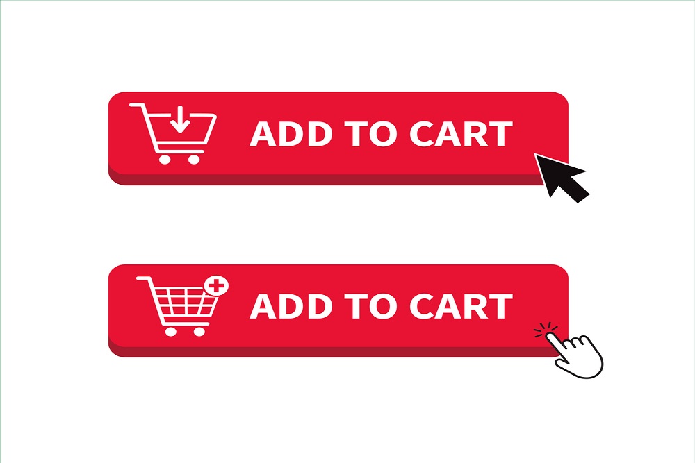
A user-oriented language includes word or phrases similar to real-world is considered significant. A prominent one in the rules of UI design. It states that instead of using system-oriented words, one should focus on using user-oriented phrases.
For example, add to cart has been used by many e-commerce stores. This word is used to add a connection between the real and computerised world. So, this word ‘cart’ represented the carts in shopping malls to feel more comfortable understanding.
Visibility of System Status
Among the rules of UI designs, this rule is focused on providing awareness to the people. Therefore, it always keeps users known about their current state. Mainly, what is going on at a specific time via feedback? As a result, users become well-known for system operations.
If we look at the procedure of the check-out process, users are aware of all the steps. Also, they are familiar with the step they are on. It is good to know where a person is in the process. Yet, remember. Too much information may distract a user. Therefore, stay brief.
Error Prevention

Prevention is the best cure. You must have heard this phase. Preventing errors beforehand is the best within the UI design rules. Providing an early check, bringing users with an option of yes and no is impressive. Because this is what helps in a mistaken click; furthermore, it allows the user to undo the mistaken command. Therefore, it is a perfect measure.
For example, whenever one misses the subject area in the outlook email system, it asks the user about it. Then, it asks to send without subject or not. Hence, it reminds the user to add the subject that is a perfect measure.
Choose Recognition in place of Recall

Recognition is always easy than recalling. The tiresome and busy routines are why UI designers have added this to the rules of UI design. Also, it improves the ease of people as well as the process. Therefore, recognition is preferred instead of recall. For a good understanding, let’s explain the difference between the two terms.
A recall is to retrieve information from one’s memory. On the other hand, recognition means to make one recognise an event or info in the memory. The primary difference between recall and recognition is the cues. Whether it been provided or not?
Providing cues helps in memory retrieval. However, the recall has a very low or not at all cues ratio than recognition. Therefore, it’s error-prone and laborious.
For instance, If you open a system after a month. The system asks you to enter the phone number in the password. It is recognised as you will remember your phone number easily. Otherwise, if you are asked to enter a password directly, which gives no cues, it recalls.
User Control and Freedom

Everyone likes to feel in control of a system when they use it. Keeping in mind this rule was another addition to the rules of UI design to promote user-friendliness. It sometimes happens that users mistakenly clicks at a place they don’t want to. Consequently, they need to exit from the mistaken command they have provided. No one wants to go through a long process to leave. This addition has saved users from frustration as well. Also, it promotes the feeling of control of a system, as when one quickly exits from an unwanted area. Its example can be noted in many systems that have a close a specific option or a cross button.
Flexibility and Efficiency

Every person isn’t aware of all the systems on the web. These measures in all the rules of UI design adds much value to this field. It focuses on that system must be easy for experienced as well as new users. Furthermore, it modifies the usability and interaction of users that are experienced with the system. Also, it gives an alternative option to choose from.
For example, let’s take the top-rated Instagram app. It provides a heart icon (on pictures or videos) to give a like for new users. Also, for experienced users, it has a double-tap option to like that picture.
Help and Support

This rule among the rules of UI design says that the best is when a system doesn’t have documentation. Yet, when some direction is essential to provide, the info regarding that must be easily visible. It must be brief, and preference is given to a step-by-step procedure.
Support section or videos for assistance can be an excellent example of this. Slack is a widely known example of this. It can provide users with brief information and guidance. In addition, help centres on different platforms is a good example.
Minimalist Design and Aesthetic
To catch the attention and for briefing the content. This rule was added to the list of 10 rules of UI design. This rule appreciates a pleasant design and brief content. Indeed, for making people stay relevant, this rule has gain worth. To sum up, it avoids irrelevant material and an obstacle within the user-friendliness. It promotes good system-user friendliness. This rule does not limit the user to use only one colour. Yet, it limits to use of those colours that do not have a match.
Moreover, it promotes those designs that do have necessary elements. Other than that, this rule clarifies the worth of communicative elements over decorative ones. Let’s understand by an example. A website having no communicative designs and only a highly coloured sharp shaped mouse doesn’t fit well with sight. On the other hand, a round-shaped mouse with a decent colour scheme is more communicative. Also, it works well to one’s sight while seeing it.
Consistency and Standards

This rule, among all other rules of UI design, promotes consistency and some fixed standards. It is made so that designers avoid designing worldly known images or icons differently to make them unique. There is a standard definition of icons and symbols that must not be changed. Hence, it remains consistent throughout.
For example, a higher is generally shown with an upward arrow. On the other hand, a lower rate is demonstrated by a down arrow. If we see the BBC comment section, it does the opposite; it uses a down arrow for the highest-rated. For the lowest rates, it utilises an upward arrow. This is characterised as inconsistent, not followed by worldly standards.
Assistance to Users

Rules of UI have been made to provide feasibility to users and improving the standards of UI design. Ease is provided in a way that errors are represented in plain language. Human understandable language is preferred with no codes. Additionally, it’s an easy way to indicate a problem and suggests a solution. It enables the user to know when an error occurs via an error message. Moreover, suggestions are also provided so that a user can quickly solve a problem.
For instance, Google has a search bar that when no result of a word has said ‘no result found. Also, it suggests user some relevant words to their query. Therefore, they can come to know that what they can do further.
Apart from Jacob Neilsen 10 rules of UI design, some other rules are established to make UI design better. Let’s have a view of those rules as well. As the below-mentioned rules also hold greater importance under the title of ‘rules of UI design’.
UI design that is suitable for all
It is estimated that about 8 per cent of people using the internet have an improper vision. Therefore, choosing colours with a pleasant effect on the eyes is a good choice. For instance, the blue colour depicts coolness and trust and companies like Intel, HP, and skype uses it. Also, for a good view, try to display information or content in block style. Thus, this also adds itself to the significant rules of UI design.
Conduct an A/B testing
A/b testing is also known as split testing. It is an experimentation process where two or more designs or themes are made. These two are tested at the same time to check which is better. The one that fits better to the niche and is user-friendly is then selected. In this regard, consider that a mobile app has two versions. Dark and light. It will be checked that which one has a clear view and a pleasant effect.
Check the Placement of buttons
Rules of UI design are made to promote user-friendliness and engagement of people. Some old trends are out of fashion now, for instance, the redaction buttons. Efficiency within this regard is promoted by picture blocks or info. For example, every section has different buttons. The known clothing brand Outfitter’s website has separate sections for men and women clothing with pictures, information and buttons.
Check the hierarchy order of elements
Among rules of UI design, element hierarchy holds greater importance. It implies that the components on any page need to have a good chain of importance (hierarchy) for both utility and how the user views the page. Fundamentally, you need to ensure that the main significant functions or services, in some cases, are at the highest point (top) of the pages. Furthermore, this sort of order can lead the user down the page, driving the user through the service.
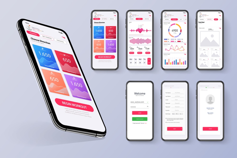
Significant components that lessen in size as you move through the whole page indicate the importance and good order. Similar is the case with colours and contrast. Utilising whitespace is likewise significant, as mess can slow down user progress and draw the eye away from the reason one came over the page. Finally, clean lines, a good space, and well-defined elements can provide an optical path to the viewers on travelling through the UI with no documentation or explanation. A quick guideline is to keep things moving from left to right and top to bottom. For instance, many fitness websites have exercise schedules mentioned in a hierarchical order.
Conclusion

Among all rules of UI designs, ‘Neilsen Heuristics’ are the essential rules of UI design. A simple strategy used in developing the rules of UI design considers the designs that are
- Simple and greater user-friendly
- Brief (limited)
- Pleasant
- Have a good colour scheme
These are the basics on which all rules of UI design are formed. One must consider these aspects when making a good UI design. Also, it would be best if you had to learn some other elements before applying the rules of UI design. Finally, one must ensure the aims of his business with extensive research over the targeted audience. After these necessary points, one must try A/B testing to achieve the best results.
Now next step is to explore the Best Ui/UX Inspiration Websites to proceed further in UI/UX Design.